Written by Peer Writing Advisor, Hayley Morgan.
As university students, you’re constantly striving to make your academic work stand out. Some disciplines require proof of research conceptualisation in its early stages (see for example, Braun and Clarke’s (2006) famous OSOP of Thematic Analysis). Others prefer tables to assemble examples of data which would otherwise make reading your work difficult. Whether it’s an essay, research project, or presentation, the effective use of images, visual aids, and tables can add depth and clarity to your work. Here’s how to use them wisely and take your assignments to the next level.
Why Use Visuals in Academic Work?
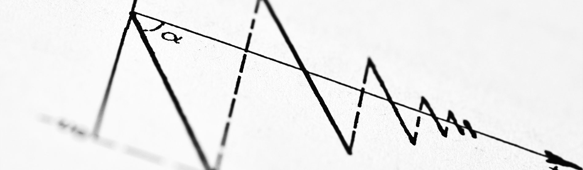
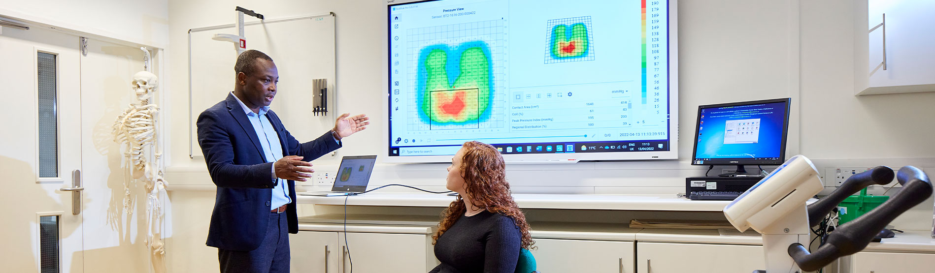
Images, charts, and tables are more than just decorations they’re tools for communication. While visuals may seem more suited to other forms of communication such as social media, browsing and so on, a well- placed visual can show the reader that you’re presenting complex information in a variety of ways. For example, a well-placed table or image can:
- Simplify complex data by presenting it visually.
- Engage your audience (reader, marker, attendees) by making your work more dynamic and memorable.
- Support your arguments with clear, illustrative examples.
Remember, visuals should enhance your content, not distract from it. Every image or table must have a purpose. Be aware, that while using tables to reduce word count is seemingly a common tool, don’t rely on this too often. It could take away from your fluency and writing style if it becomes a habit.
Making the Most of Tables and Charts
Tables and charts are invaluable for presenting data. To use them effectively:
- Keep Them Simple: Avoid overloading tables with too much data. Focus on key points. Appendices are for extra data too but are not a dumping ground for unedited data.
- Label Clearly: Make sure your table or chart has a title, labels, and a legend (if necessary) to ensure clarity.
- Integrate into the Text: Refer to your table or chart in the body of your work, explaining its significance.
- Consider Accessibility: Use colors and patterns wisely, ensuring they are accessible to those with visual impairments. Fonts with serifs can be particularly difficult for some people with dyslexia, so make sure to avoid these and be aware of spacing.
Reaching Out for Expert Guidance
Feeling stuck? Your university librarians are an incredible resource. Your LibGuide subject specialist can:
- Help you with strategies to find high-quality, credible images and datasets.
- Guide you on copyright and citation rules.
- Offer advice on tools for creating visuals like infographics or charts.
To contact your librarians, check your university library’s website. Swansea University libraries offer live chat, email services and one-on-one consultations on campus. Don’t hesitate to reach out – they’re there to support you and are a cornerstone of your university experience.
By incorporating thoughtful visuals into your work, you can communicate your ideas more effectively and leave a lasting impression on your readers or audience. Give it a try and see the difference it makes!
Sources.
Braun, V., & Clarke, V. (2006). Using thematic analysis in psychology. Qualitative Research in Psychology, 3(2), 77–101. https://doi.org/10.1191/1478088706qp063oa